
30 Days, (almost) 30 Maps, One Team
This November, the Plan4Better team turned the #30DayMapChallenge into a collective adventure. Here you can check out the maps we have created!

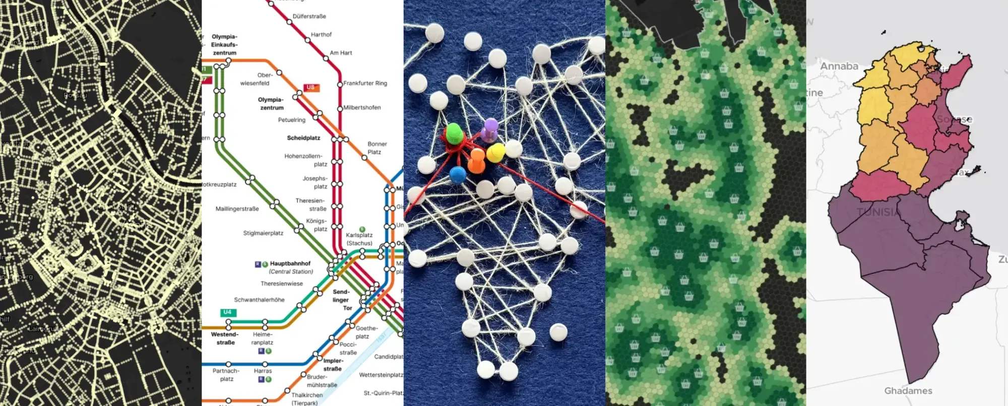
This November, the Plan4Better team took on the #30DayMapChallenge—not as solo cartographers, but as a collective. Why? Because 30 maps in 30 days is a lot for one person (we tried last year, trust us). But as a team? It became an opportunity to experiment, collaborate, and push the boundaries of what we can do with and without GOAT, our open-source planning tool.
From streetlights in Vienna to Saharan dust plumes over Tunisia, from colorblind-friendly subway maps to analog string art, we turned data into stories. Here’s how we did it, and what we learned along the way.
The maps we’ve created
We didn’t just make maps—we told stories. Here’s a peek at the highlights of each map:
**Day 1 & 3 : Points and Polygons - “Don’t try to see the stars in Vienna, you won’t
succeed“ by Camila**
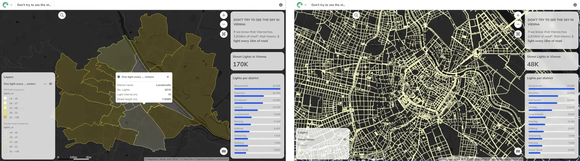
Camila’s streetlight density map started with a late-night run. Too many lights, she thought. So she dug into Vienna’s open data and found:
- 170,212 streetlights—one every 16 meters.
- The 1st district (historical, tourist-heavy) had the highest density: one light every 9 meters.
But here’s the twist: Coming from Buenos Aires, where light = safety, she wondered: Does more light always mean safer streets? Or does it just mean… more light pollution?
Day 4: My Data - “A GOAT Walks into Marienplatz” by Gokul
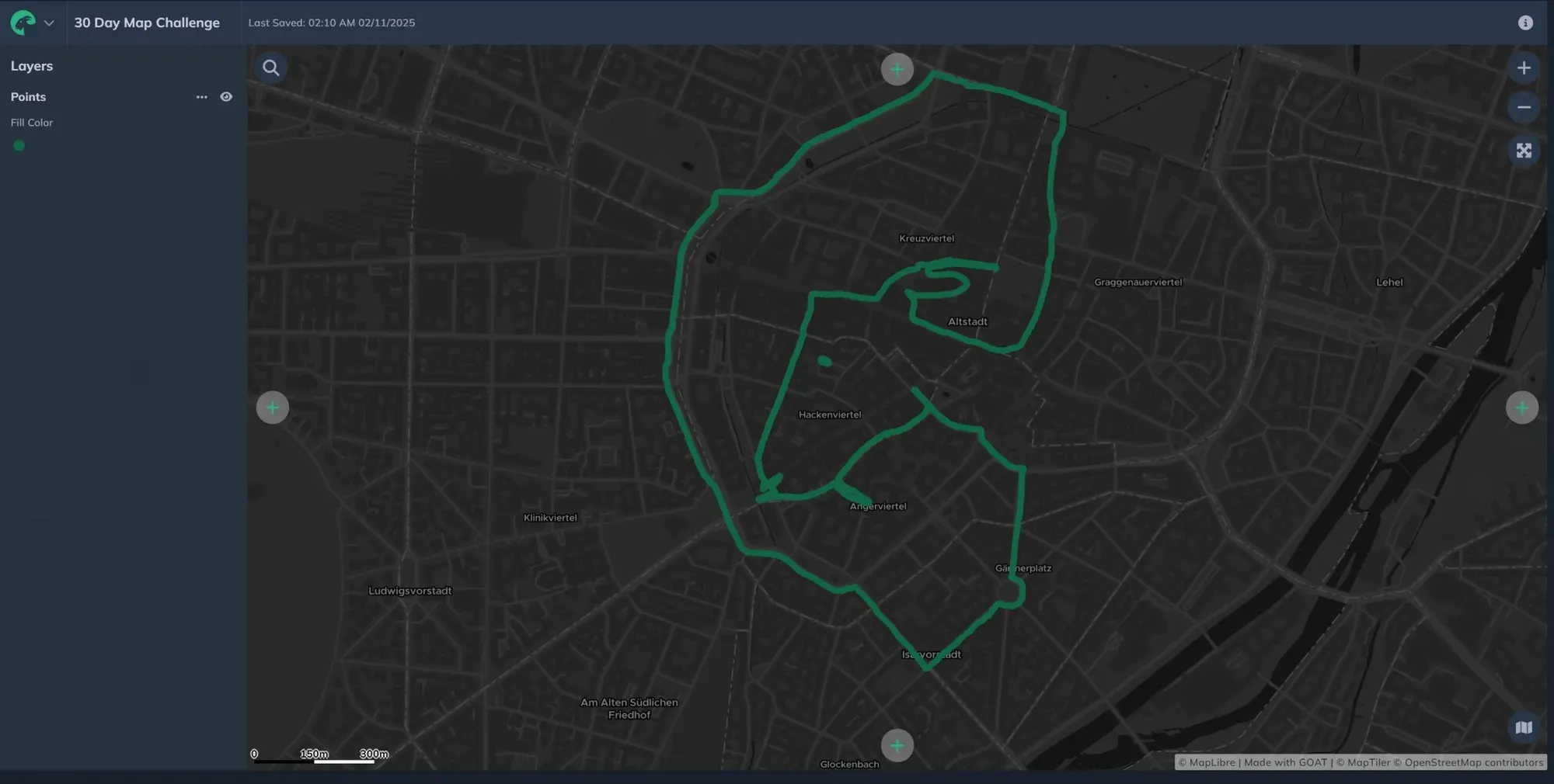
Drawn along Munich’s bike and walking paths, Gokul conducted a small experiment exploring the space between active mobility and urban form. He traced a (very urban) GOAT to ask: ‘How can movement—or a simple walk through Munich—become a drawing?’
**Days 5, 10, 15 & 20: Earth, Air, Fire and Water - “Tunisia’s climate through the
elements“ by Cyrine**
Cyrine used the #30DayMapChallenge to explore climate patterns in Tunisia—her home country—through the lens of earth, air, fire, and water. With Sentinel and Copernicus satellite data, she analyzed:
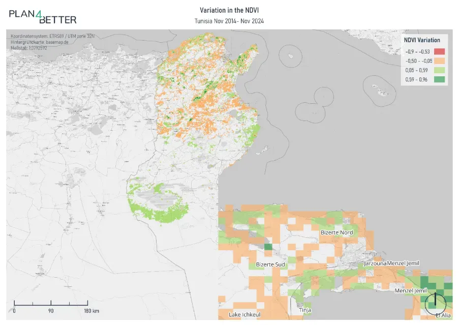
- 🌱 Day 5: Earth – “Is the Desert Blooming?” Vegetation changes (NDVI) between 2014–2024 revealed improved greenery in the south—real progress or a data quirk? No generalized national deterioration is observed, and the average NDVI is quite stable.
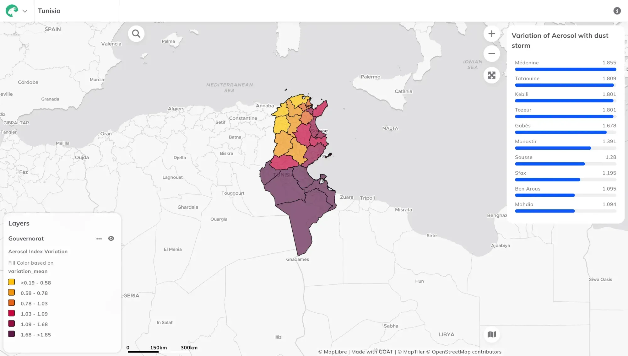
- 💨 Day 10: Air – “When the Sahara Takes Over” A dust plume event (March 2024) spiked the Aerosol Index from 0.377 to 1.764, raising questions about air quality and health risks.
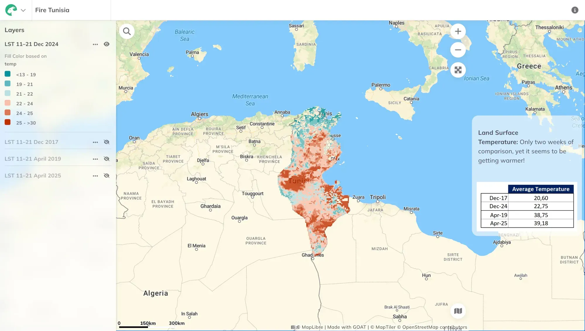
- 🔥 Day 15: Fire – “Heatwaves in Color” Land Surface Temperature data compared 2017–2019 vs. 2024–2025, showing rising heat—but with gaps in satellite coverage leaving room for debate.
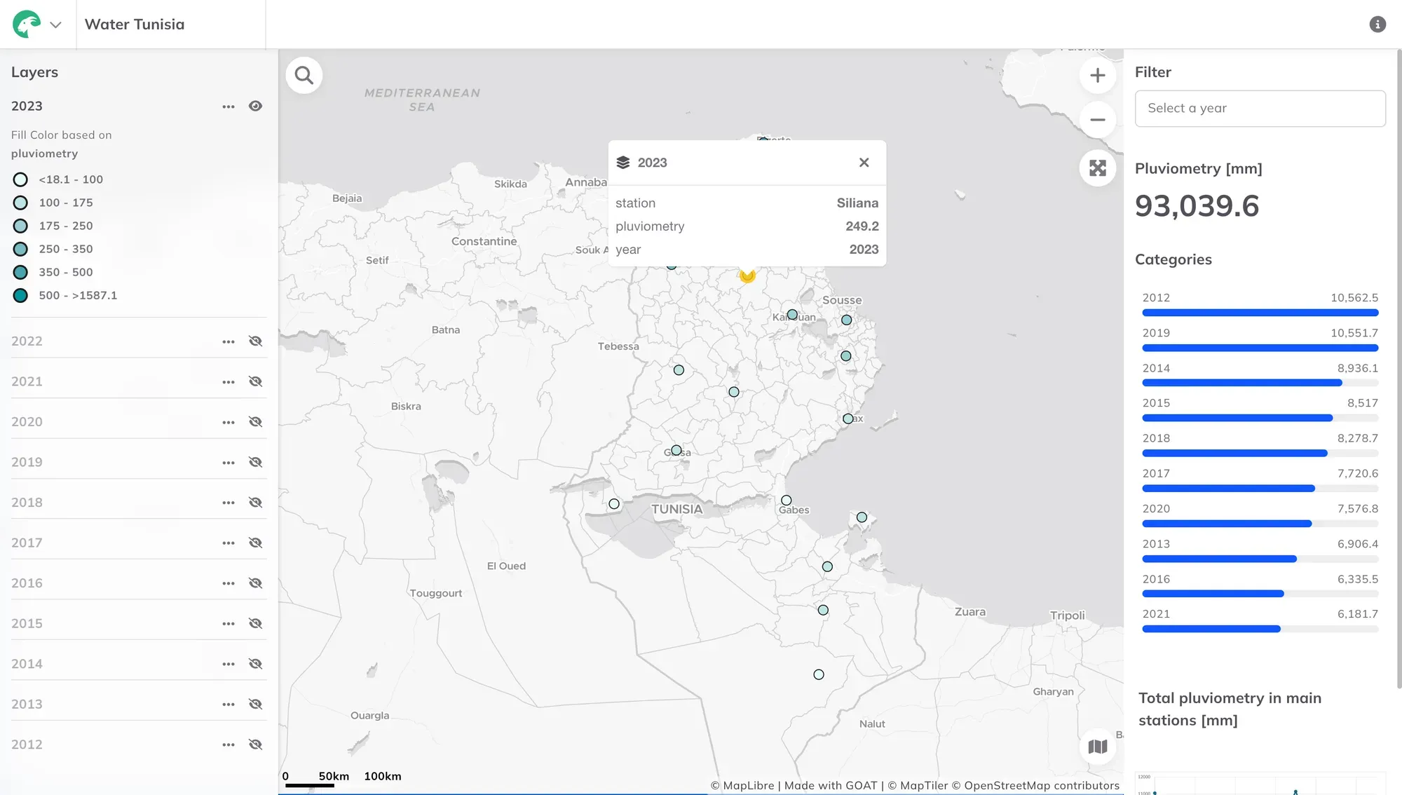
- 💧 Day 20: Water – “Where Did the Rain Go?” Precipitation data exposed a drying trend: Tunisia’s rainfall has dropped since 2019, with the last three years marking the lowest levels since 2012.
Day 7: Accessibility – “Munich’s U-Bahn, Now in Color(blind-Friendly)” by Noemi
Munich’s subway map is iconic, but not for everyone. Noemi reworked the color palette to make it deuteranopia-friendly (that’s green-blindness, for those unfamiliar).
Why it matters:
- 1 in 12 men have some form of color blindness.
- Small tweaks in design can make public transit usable for all.
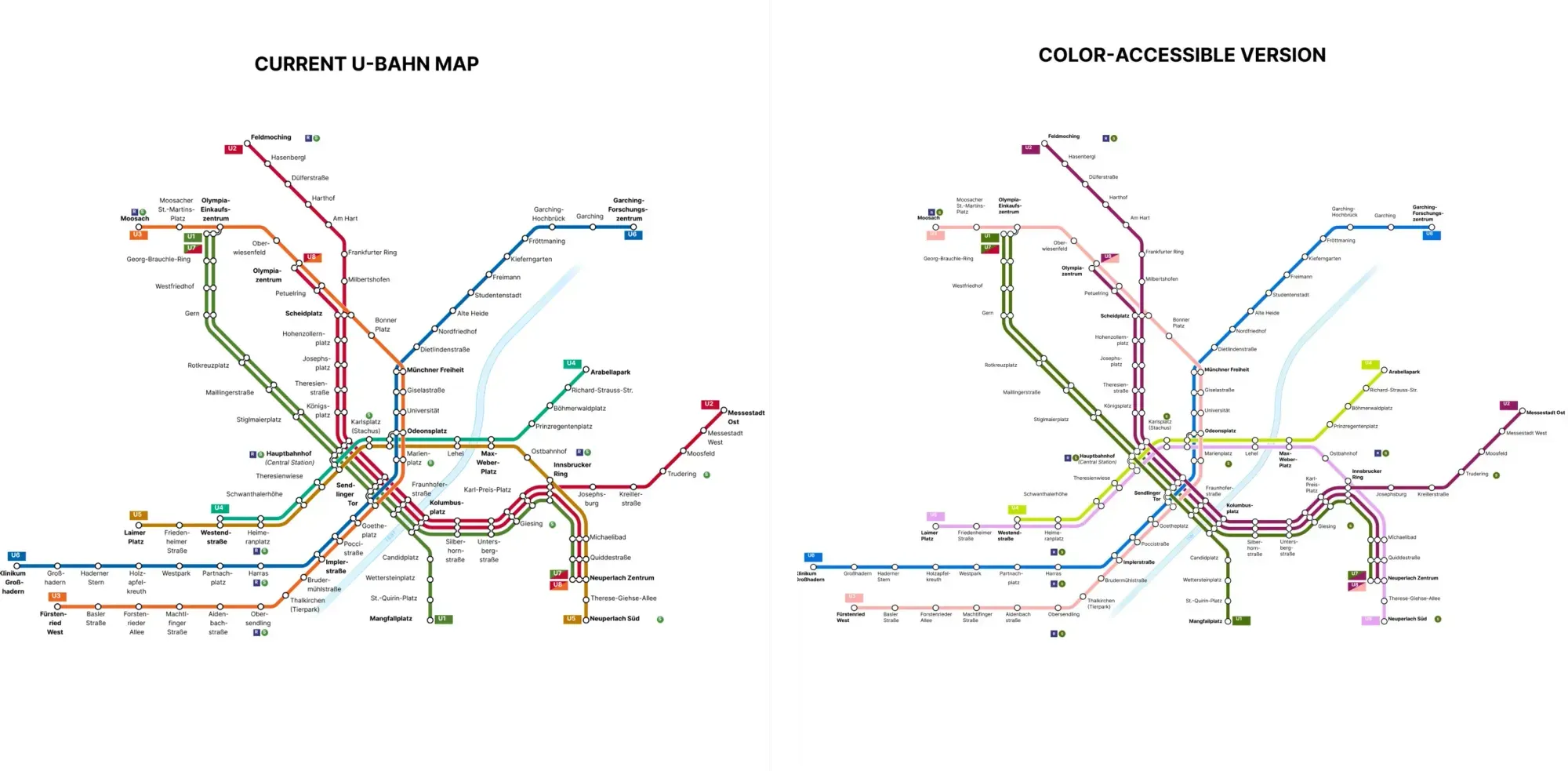
🔗 Check the comparison throughout the different color blindness types
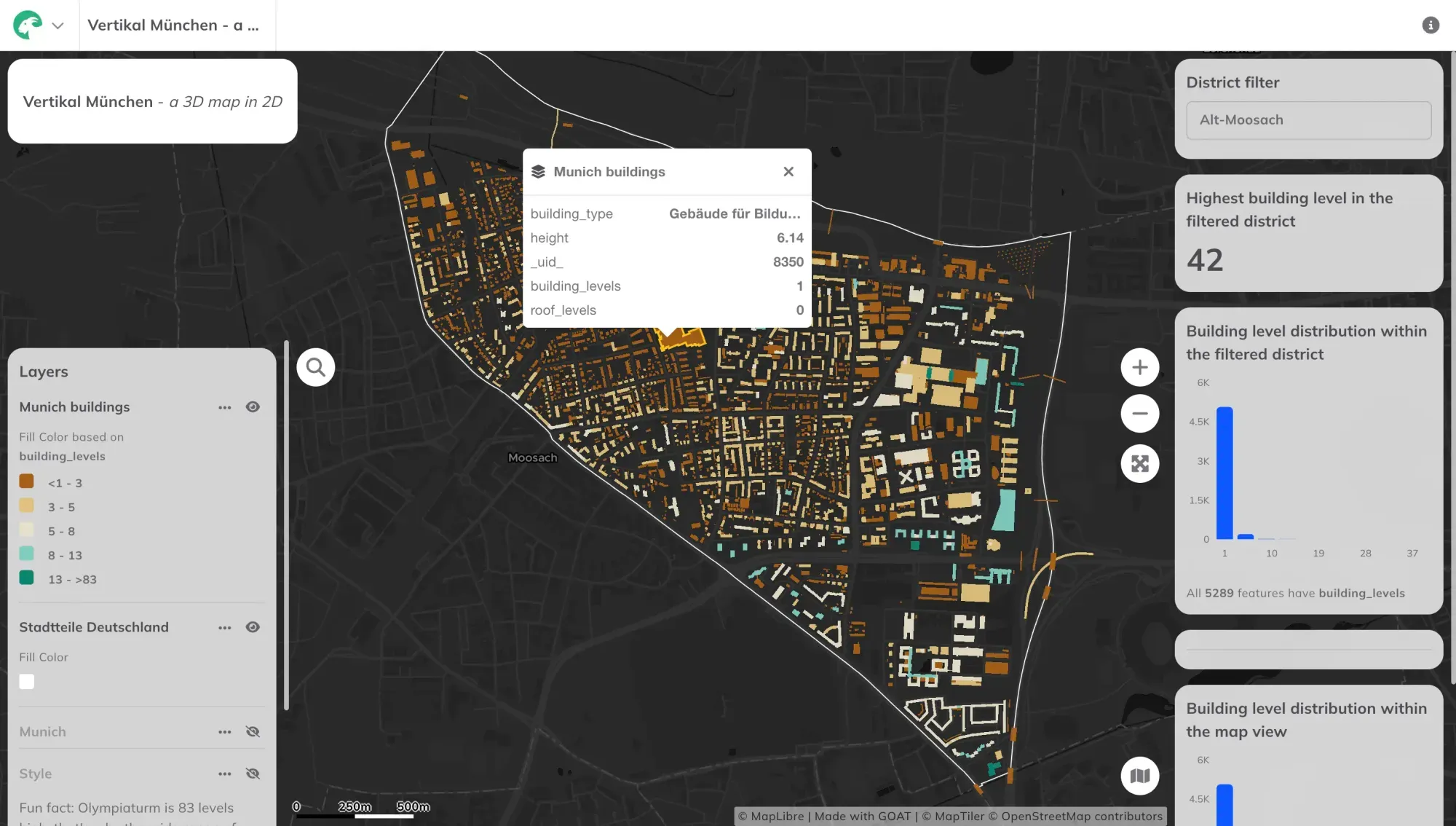
Day 8: Urban – “Vertikal München - a 3D map in 2D” by Noemi
For World Urbanism Day, Noemi built an interactive dashboard of Munich’s building heights. Fun fact: The Olympiaturm is the tallest—but how many levels does it have? (We’ll let you guess.)
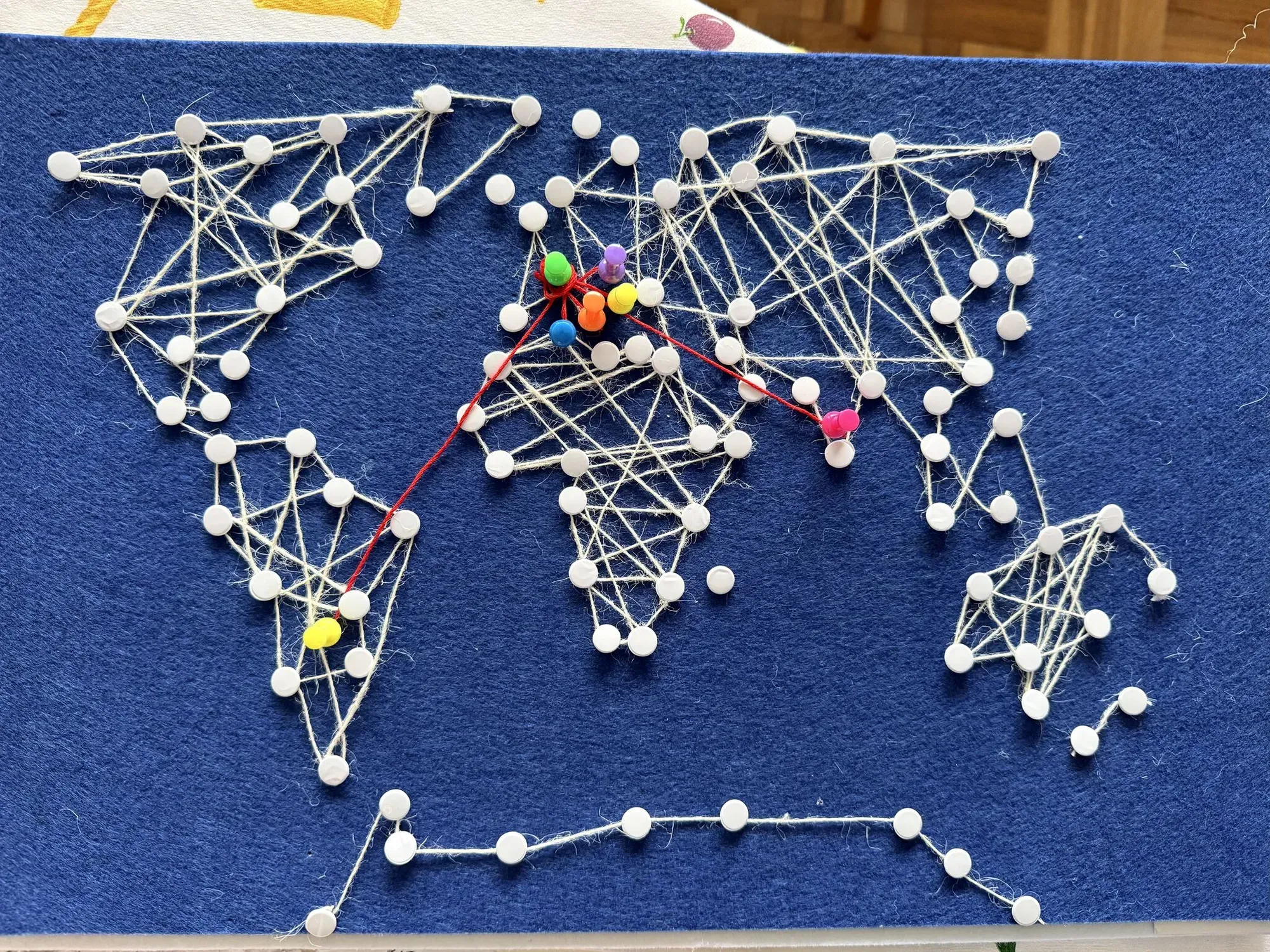
Day 9: Analog – “String Art meets team diversity” by Marta
New to the team, Marta swapped pixels for pins and created a string art map tracing our team’s journeys to Munich.
The idea:
- White strings = the world.
- Red strings = our individual paths from four continents.
A reminder that our best work comes from mixing global perspectives with local action.
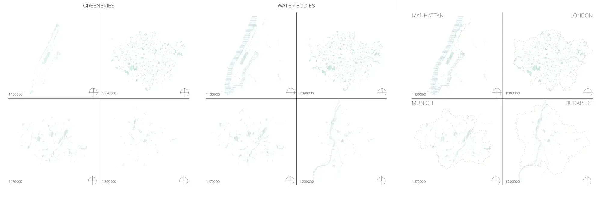
**Day 11: Minimal map – “How little ink does it take to identify a place?” by
Noemi**
How little ink do we need to recognize a place? Noemi mapped three cities and a district using only greenery and water bodies, filling them with hatched lines. Is it enough to recognise them? You can check the step by step on the post.
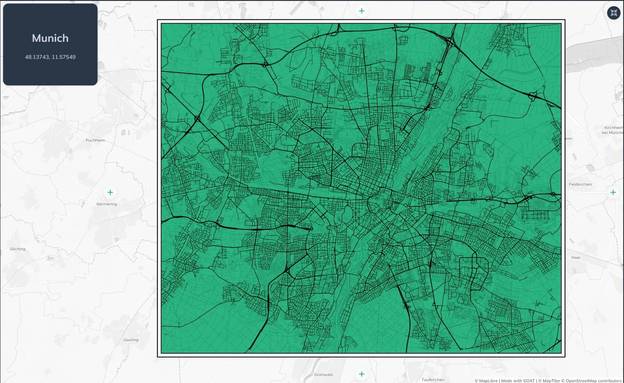
Day 12: Data challenge: OpenStreetMap – “Minimal Munich” by Gokul
A minimalist map of Munich using the street network from OSM, a clean form of the city, made entirely with GOAT.
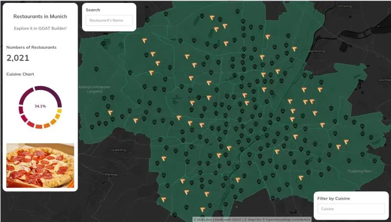
**Day 17: A new tool – “Restaurants in Munich” by Marta
What would you do if you used GOAT for the first time? Of course, what Marta did: map all of Munich’s restaurants, but highlight the Italian ones🍕.
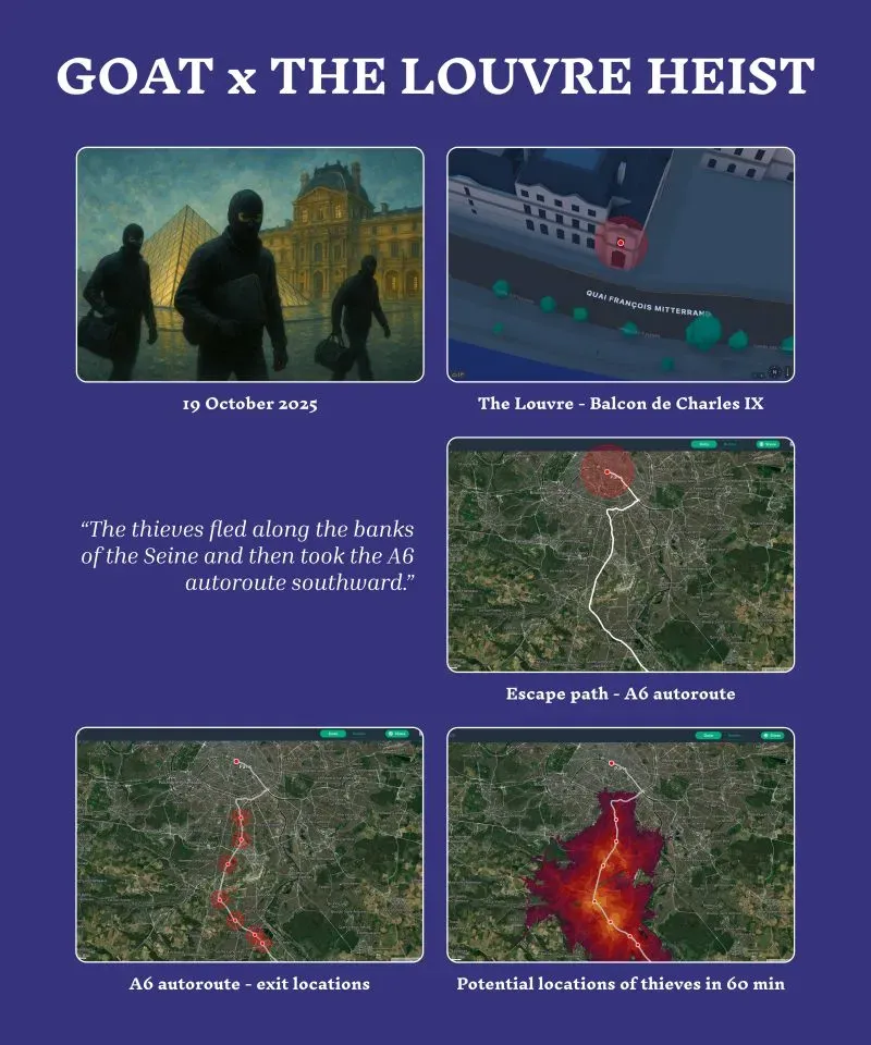
**Day 18: Out of this world – “GOAT x THE LOUVRE HEIST” by Nihar
We had thought of many different use cases for GOAT, but using it to solve a case was the idea of Nihar. In his words: “Starting from Balkon de Charles IX, they fled along the Seine before taking the A6 autoroute southward from Paris.This multi-catchment area predicts their potential locations ~60 mins after the heist, originating from exits along the autoroute.”
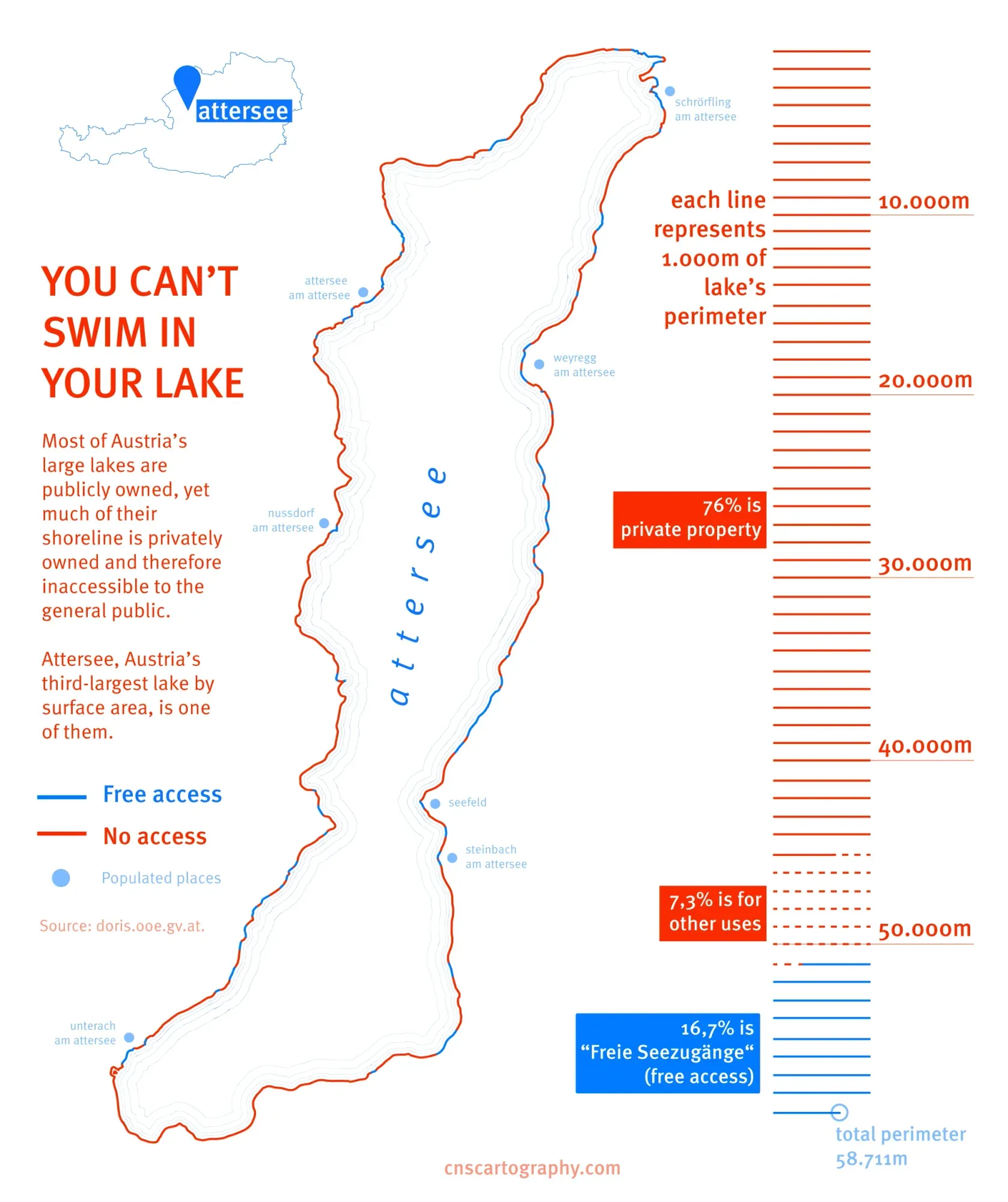
Day 20: Water – “You can’t swim in your lake” by Camila
**Austrian lakes are public, but their shores? Often private.**Camila’s map exposed the pocket beaches, tiny public strips sandwiched between roads and private gardens.
The bigger question: Countries like Sweden and Argentina have Jedermannsrecht (“freedom to roam”). So why doesn’t Austria?
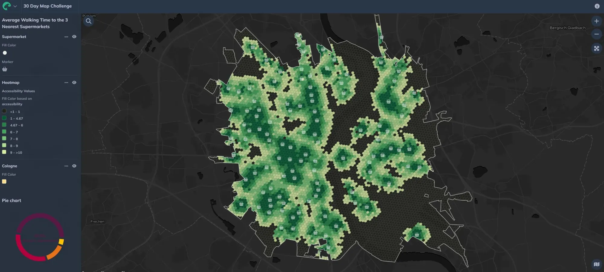
Day 25: Hexagons – “Hexagons & Supermarket Accessibility (Cologne)” by Gokul
Using the Closest Average Indicator from GOAT, Gokul mapped the accessibility to supermarkets considering the three nearest supermarkets reachable within a 10-minute walk in Cologne.
Key insight:
- Ehrenfeld scored high (walkable, dense).
- Areas near major roads or rail lines? Not so much.
What’s Next?
The #30DayMapChallenge is over, but the experiments aren’t. Here’s what we’re taking forward:
- More “behind-the-scenes” content: Showing how we make maps, not just the final product.
- GOAT improvements: While making the maps, we found some bugs and new features we wished we had. We’re already building them (stay tuned!).
- **New decoration for the office:**Some of these maps are going to be printed and hung on the walls of our office :)
Try It Yourself!
Inspired? Here’s how to run your own team map challenge:
- Pick a tool (we’re biased toward GOAT, but QGIS, Illustrator, or even pen and paper work!).
- Assign themes based on strengths (e.g., climate data lovers vs. urban design nerds).
- Set time limits—some of our best maps took under an hour.
- Tell a story: Ask, “Why should someone care about this map?”
If you want to use GOAT, you can sign up for a 14-day trial here.